---
URL: "/zh-CN/blog/2025-10/css-shape.html"
LLMS_URL: "/zh-CN/blog/2025-10/css-shape.md"
lastUpdated: true
commentabled: true
recommended: true
title: "CSS 全新属性如何实现一个内凹圆角"
description: "CSS 全新属性如何实现一个内凹圆角"
date:

pageClass: "blog-page-class"
cover: "/covers/css.svg"
---

---
lastUpdated: true
commentabled: true
recommended: true
title: CSS 全新属性如何实现一个内凹圆角
description: CSS 全新属性如何实现一个内凹圆角
date: 2025-10-15 09:00:00 
pageClass: blog-page-class
cover: /covers/css.svg
---

## 什么是shape() ##

`shape()` CSS 函数用于定义 `clip-path` 和 `offset-path` 属性的形状。它结合了一个初始起点和一系列定义形状路径的形状命令。`shape()` 函数是*数据类型的成员*。

### 语法 ###

```css
clip-path: shape(...);

offset-path: shape(...);
```

### 为什么需要 `shape()` ###

我们之前已经有了很多 `clip-path` 类型为什么还需要 `shape()`，官方的解释 `shape-function`

虽然 `path()` 函数允许用 SVG 路径语法来定义任意的形状，但是继承了 SVG 的一些限制，例如隐式地只允许使用 `px` 单位。以及不能使用 `var()` 等 CSS 语法

`shape()` 函数使用一组大致等同于 `path() `所用命令的命令，但它使用的是更标准的 CSS 语法，并且允许使用完整的 CSS 功能，例如 `px` `rem` `%` 单位和数学函数。当 `shape()` 渲染时，这   些命令会动态地转换为实际值。

从这个意义上说，`shape()` 是 `path()` 的超集。一个 `path()` 可以很容易地转换为一个 `shape()`，但是要将一个 `shape()` 转换回 `path()` 或 SVG，则需要关于 CSS 环境的信息（例如，CSS 自定义属性的当前值、em 单位的当前字体大小等）。

也就是说我们可以在 `shape()` 中使用百分比单位！和各种 CSS 中自带得数据计算方法比如`var()` `calc()` `sin()` 等等！！

## 开胃小菜-简单得对比！💃 ##

上面说的 `shape()` 定义还是太抽象了，我们来看一个例子，和之前得 `path()` 方法对比一下~


:::demo

```vue
<template>
    <div class="shape"></div>
    <div class="shape"></div>
</template>
<script lang="ts" setup>
</script>
<style scoped>
    .shape {
        --r: 6px;
        height: 64px;
        width: 189px;
        background: linear-gradient(60deg, #BD5532, #601848);
        color: #fff;
        border-radius: 12px;
    }

    :nth-child(1 of .shape) {
        clip-path: path("M189 0H123.486s2.909 15.998-20.337 15.998c0 0-2.909-5.821-2.909-15.998 0 0 0 8.705-5.821 8.705S88.874 0 88.874 0c0 10.129-2.909 15.998-2.909 15.998-23.246 0-20.337-15.998-20.337-15.998H0c36.295 4.364 30.486 36.295 30.486 36.295 56.691-11.608 64 27.387 64 27.387s7.309-38.995 64-27.387c0 0-5.821-31.998 30.486-36.295z");
    }

    :nth-child(2 of .shape) {
        clip-path: shape(from 100% 0%,hline to 65.34%,smooth by -10.76% 25.12% with 1.54% 25.12%,curve by -1.54% -25.12% with 0% 0%/-1.54% -9.14%,curve by -3.08% 13.67% with 0% 0%/0% 13.67%,smooth to 47.02% 0% with 47.02% 0%,curve by -1.54% 25.12% with 0% 15.91%/-1.54% 25.12%,curve by -10.76% -25.12% with -12.3% 0%/-10.76% -25.12%,hline to 0%,curve by 16.13% 56.99% with 19.2% 6.85%/16.13% 56.99%,curve by 33.86% 43.01% with 30% -18.23%/33.86% 43.01%,smooth by 33.86% -43.01% with 3.87% -61.23%,curve by 16.13% -56.99% with 0% 0%/-3.08% -50.25%,close);
    }
</style>
```

:::


没有任何变化！这其实也证明了 *`shape()` 是 `path()` 的超集*，`path` 的路径是非常容易转变成 `shape`，给大家分享一个网站可以自动转换 `path` ~ ([SVG to CSS Shape](https://link.juejin.cn/?target=https%3A%2F%2Fcss-generators.com%2Fsvg-to-css%2F))

话又说回来！如果只是 `shape` 可以完成和 `path` 一样的效果那完全没有必要使用 `shape` 呀，刚才举得例子是我们的元素大小和图形完全一致，接下来我们拉伸一下元素大小甚至改变一下元素的比例看看！

我们使用 `shape()` 可以适配不同比例以及不同大小，而使用 `path()` 由于不支持百分比只能按照最初的大小展示！

也就是说之前如果很多不规则形状的元素，之前苦于 `path()` 无法适应不同尺寸不同比例而只能用切图方案，现在都可以采用 `shape()` 来完成！！

## 正式开始学习！🤖 ##

现在我们可以正式开始学习 `shape()`的用法，来一个简单的例子！

> tip: `shape()` 需要 `chrome >= 135` 才有效果！

:::demo

```vue
<template>
  <div class="shape"></div>
</template>
<script lang="ts" setup>
</script>
<style scoped>
    .shape {
        background: repeating-linear-gradient(45deg, #F07818 0 15px, #F0A830 0 30px);
        color: #fff;
        width: 200px;
        height: 200px;
        clip-path: shape(from 0 0,line to 100% 0,vline to 100%,hline to 0,close);
    }
</style>
```

:::

此时是没有任何裁切效果的，我们就从这个例子开始学习 `shape()`，`from 0 0` 毫无疑问，定义了这个形状的起始点

### line/vline/hline ###

`line [x] [y]` 也很明显就是指从上一个起始点后绘制一条直线到我们指定的 `x` `y`，如果我们需要一个三角形可以调整一下 `[x] [y]`

:::demo

```vue
<template>
  <div class="shape"></div>
</template>
<script lang="ts" setup>
</script>
<style scoped>
    .shape {
        background: repeating-linear-gradient(45deg, #F07818 0 15px, #F0A830 0 30px);
        color: #fff;
        width: 200px;
        height: 200px;
        clip-path: shape(from 0 0,hline to 100%,line to 0 100%,close);
    }
</style>
```

:::


似乎一切都很容易，但是求豆麻袋！`hline` 和 `vline` 是什么!

其实 `hline` 还有 `vline` 的本质就是 `line` 的简写，`hline` 可以让我们忽略 `[y]` 自动保持为上一个命令的 `[y]`，`vline` 可以让我们忽略 `[x]` 自动保持为上一个命令的 `[x]`

### arc ###

`arc` 命令就是画圆弧形状的命令，看下语法

`<arc-command>`：指定为  `arc to Xb Yb of R [large or small] [cw or ccw] rotate <angle>`。此命令将一个椭圆曲线命令添加到形状命令列表中。

它在起始点和结束点之间绘制椭圆弧

**举一个🌰**

:::demo

```vue
<template>
  <div class="shape"></div>
</template>
<script lang="ts" setup>
</script>
<style scoped>
    .shape {
        background: repeating-linear-gradient(45deg, #F07818 0 15px, #F0A830 0 30px);
        color: #fff;
        width: 200px;
        height: 200px;
        --r: 25px;
        clip-path: shape(from 0 0, arc to calc(var(--r) * 2) 0 of var(--r), hline to 100%, vline to 100%, hline to 0%, vline to 0);
    }
</style>
```

:::

这个例子也体现了用 `shape()` 的一大优势，可以直接使用css变量和计算! 其中 `Xb` 和 `Yb` 是我们圆弧的终点，`R` 是我们的圆弧半径~如果我们想把圆弧移动到中间应该考虑和之前我们学习的 `line` 命令结合！

:::demo

```vue
<template>
  <div class="shape"></div>
</template>
<script lang="ts" setup>
</script>
<style scoped>
    .shape {
        background: repeating-linear-gradient(45deg, #F07818 0 15px, #F0A830 0 30px);
        color: #fff;
        width: 200px;
        height: 200px;
        --r: 25px;
        clip-path: shape(
            from 0 0,
            line to calc(50% - var(--r)) 0,
            arc by calc(var(--r) * 2) 0 of var(--r),
            hline to 100%,
            vline to 100%, 
            hline to 0%,
            vline to 0
        );
    }
</style>
```

:::

细心的同学可能已经注意到了我们的 `arc to` 变成了 `arc by` 命令，这两者的区别也非常简单

- by：表示本次的偏移是相对于上一个命令的结束点的位置（“相对”值）。

- to：表示本次的偏移是相对于参考框的左上角的位置（“绝对”值）。

现在我们已经基本了解了 `arc` 命令的基础用法，但是 `arc` 后面还有三个参数

- `<arc-sweep>`：指示所需的弧是否是顺时针（cw）或逆时针（ccw）围绕椭圆追踪的。如果省略，这默认为 ccw。
- `<arc-size>`：指示所需的弧是否是两个弧中较大的一个（large）或较小的一个（small）。如果省略，这默认为 small。
- `<angle>`：指定椭圆相对于 x 轴旋转的角度，单位为度。正角度将椭圆顺时针旋转，负角度将其逆时针旋转。如果省略，这默认为 0deg。

我们来依次加上这些参数看看

- `arc-sweep:cw`

:::demo

```vue
<template>
  <div class="shape"></div>
</template>
<script lang="ts" setup>
</script>
<style scoped>
    .shape {
        background: repeating-linear-gradient(45deg, #F07818 0 15px, #F0A830 0 30px);
        color: #fff;
        width: 200px;
        height: 200px;
        --r: 25px;
        clip-path: shape(   
                from 0 0,
                line to calc(50% - var(--r)) 0,
                arc by calc(var(--r) * 2) 0 of var(--r) cw,
                hline to 100%,
                vline to 100%,
                hline to 0%,
                vline to 0
        );
    }
</style>
```

:::

后面两个好像我们的圆弧消失了，其实并不是，是因为 `cw` 代表着顺时针，也就是我们的圆弧在我们的矩形上面，我们加上 `box-shadow` 看一下


:::demo

```vue
<template>
  <div class="shape"></div>
</template>
<script lang="ts" setup>
</script>
<style scoped>
    .shape {
        background: repeating-linear-gradient(45deg, #F07818 0 15px, #F0A830 0 30px);
        color: #fff;
        width: 200px;
        height: 200px;
        --r: 25px;
        clip-path: shape(   
                from 0 0,
                line to calc(50% - var(--r)) 0,
                arc by calc(var(--r) * 2) 0 of var(--r) cw,
                hline to 100%,
                vline to 100%,
                hline to 0%,
                vline to 0
        );
    }
</style>
```

:::

关于 `arc-size` 我们还需要再解释一下为什么会有两个圆弧大小可以选择
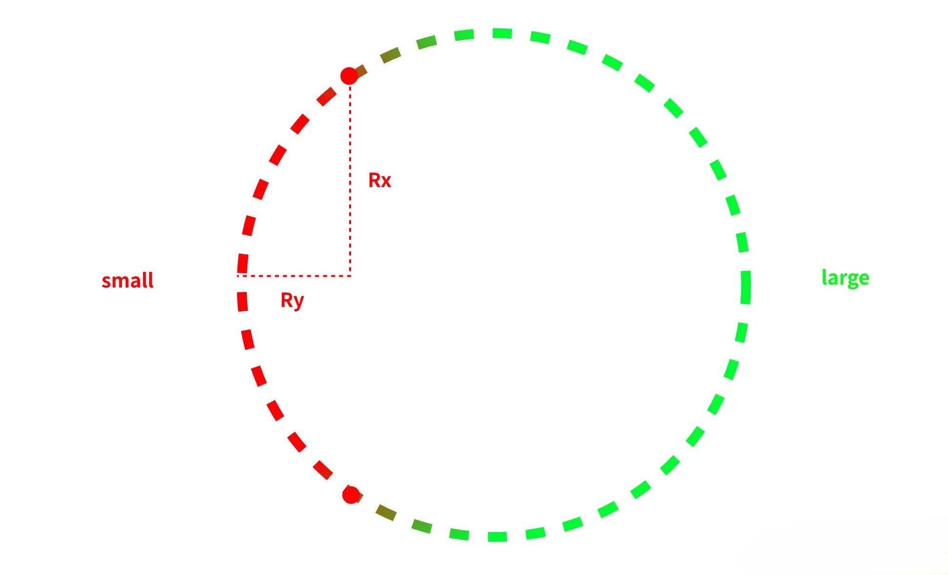

![](/images/css-shape.jpg)

如图所示，我们给定

- 起点（start point）
- 终点（end point）
- 半径（rx, ry）

可以有两个不同的椭圆弧段连接起点和终点：

- 一个小于或等于 180°（小弧 small arc）
- 一个大于 180°（大弧 large arc）

现在我们已经学会了 `line` 还有 `arc` 命令接下来去完成一个chrome选项卡的效果！

## chrome选项卡💘 ##

在不使用 `shape()` 之前如果要完成类似的效果可以说还是非常棘手并且要用一些奇淫巧计！我们来简单拆解一下这个效果用我们已经学会的几个命令来完成这个效果！


:::demo

```vue
<template>
  <div class="shape">CMONO.NET</div>
</template>
<script lang="ts" setup>
</script>
<style scoped>
    .shape {
        background: linear-gradient(60deg, #BD5532, #601848);
        color: #fff;
         --r: 26px; /* radius */
        padding: .3em 1em;
        font: bold 45px system-ui,sans-serif;
        clip-path: shape(
                from 0 100%,
                arc by var(--r) calc(-1 * var(--r)) of var(--r),
                vline to var(--r),
                arc by var(--r) calc(-1 * var(--r)) of var(--r) cw,
                hline to calc(100% - 2 * var(--r)),
                arc by var(--r) var(--r) of var(--r) cw,
                vline to calc(100% - var(--r)),
                arc by var(--r) var(--r) of var(--r)
        )
    }
</style>
```

:::


### 内凹圆角💟 ###

:::demo

```vue
<template>
  <div class="shape">CMONO.NET</div>
</template>
<script lang="ts" setup>
</script>
<style scoped>
    .shape {
        background: linear-gradient(60deg, #BD5532, #601848);
        color: #fff;
         --r: 20px; /* radius */
        --s: 30px; /* inner curve size */

        width: 150px;
        aspect-ratio: 1;
        border-radius: var(--r);
        clip-path: shape(from 0 0,
        hline to calc(100% - var(--s) - 2*var(--r)),
        arc by var(--r) var(--r) of var(--r) cw,
        arc by var(--s) var(--s) of var(--s),
        arc by var(--r) var(--r) of var(--r) cw,
        vline to 100%,
        hline to 0
        )
    }
</style>
```

:::

这个效果也是比较经典的一个效果啦，猛的一看是不是认为需要非常多的 `arc` 命令，但是我们的 `shape`其实是可以和 `border-radius` 结合来使用的，也就是我们其实只需要三个 `arc` 命令来实现这个效果！
