---
URL: "/zh-CN/blog/2024-12/react_native_pixel_ratio.html"
LLMS_URL: "/zh-CN/blog/2024-12/react_native_pixel_ratio.md"
lastUpdated: true
commentabled: true
recommended: true
title: "React Native 之 像素比例"
description: "React Native 之 像素比例"
date:
pageClass: "blog-page-class"
---
---
lastUpdated: true
commentabled: true
recommended: true
title: React Native 之 像素比例
description: React Native 之 像素比例
date: 2024-12-16 15:18:00
pageClass: blog-page-class
---
# React Native 之 像素比例 #
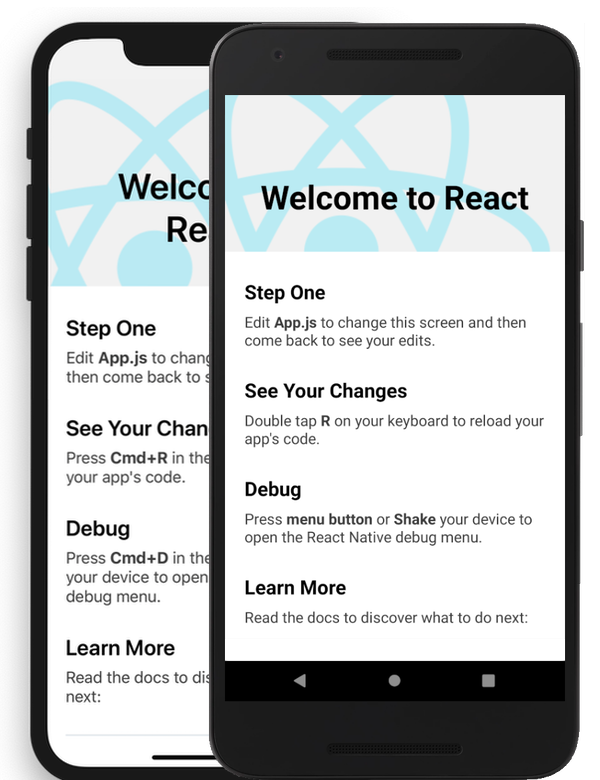
在 React Native 中,PixelRatio 是一个用于获取设备像素比(Pixel Ratio)的实用工具。像素比(或称为设备像素密度、DPI 密度等)是物理像素和设备独立像素(DIPs 或 DPs)之间的比率。设备独立像素是一种抽象的度量单位,使得开发者可以编写不依赖于特定屏幕分辨率的代码。
{class="flex items-center justify-center"}
## 根据像素密度获取指定大小的图片 ##
```ts
//如果应用运行在一个高像素密度的设备上,显示的图片也应当分辨率更高。
//一个取得缩略图的好规则就是将显示尺寸乘以像素密度比:
const image = getImage({
width: PixelRatio.getPixelSizeForLayoutSize(200),
height: PixelRatio.getPixelSizeForLayoutSize(100),
});
```
```vue
import React from 'react';
import { View, Text, PixelRatio, StyleSheet } from 'react-native';
import { Dimensions } from 'react-native'; //使用了 `Dimensions` API 来获取屏幕宽度
const MyComponent = () => {
// 使用 PixelRatio 来获取像素比
const pixelRatio = PixelRatio.get();
返回设备的像素密度,例如:
PixelRatio.get() === 1
mdpi Android 设备
PixelRatio.get() === 1.5
hdpi Android 设备
PixelRatio.get() === 2
iPhone SE、6S、7、8
iPhone XR系列
苹果手机 11
xhdpi Android 设备
PixelRatio.get() === 3
iPhone 6S Plus、7 Plus、8 Plus
iPhone X、XS、XS Max
iPhone 11 Pro、11 Pro Max
像素, Pixel 2
xxhdpi Android 设备
PixelRatio.get() === 3.5
Nexus 6(英语:Nexus 6)
Pixel XL、Pixel 2 XL
xxxhdpi Android 设备
// 假设我们想要一个始终占据屏幕宽度 1/3 的元素
// 但我们希望这个元素的高度是其宽度的 2 倍(在 DIP 中)
// 我们可以通过 PixelRatio 来调整其高度,以确保在不同分辨率设备上看起来一致
const elementWidth = Math.round(PixelRatio.getPixelSizeForLayoutSize(Dimensions.get('window').width / 3));
const elementHeight = Math.round(pixelRatio * 2 * (elementWidth / pixelRatio));
// 注意:由于我们使用的是 PixelRatio 来调整高度,所以即使在不同分辨率的设备上,
// 这个元素的高度也会相对于其宽度保持 2:1 的比例
return (
Pixel Ratio: {pixelRatio.toFixed(2)}
);
};
const styles = StyleSheet.create({
container: {
flex: 1,
justifyContent: 'center',
alignItems: 'center',
padding: 20,
},
});
export default MyComponent;
```
## PixelRatio.getFontScale() 方法使用 ##
> PixelRatio.getFontScale() 是 React Native 中的一个实用方法,用于获取设备的字体大小缩放比例。这个比例对于响应式设计特别有用,因为它允许你根据用户的字体大小设置来动态调整 UI元素的大小。
### 动态调整字体大小代码栗子 ###
```ts
import { PixelRatio } from 'react-native';
const baseFontSize = 18; // 设计稿上的字体大小
const fontScale = PixelRatio.getFontScale(); // 获取字体缩放比例
// 计算动态字体大小
const dynamicFontSize = Math.round(baseFontSize * fontScale);
// 在样式中使用动态字体大小
const styles = {
myText: {
fontSize: dynamicFontSize,
},
};
```
### getPixelSizeForLayoutSize() ###
将一个布局尺寸(dp)转换为像素尺寸(px)。返回一个整数数值。
```ts
static getPixelSizeForLayoutSize(layoutSize: number): number
```
### roundToNearestPixel() ###
将布局大小 (dp) 四舍五入为与整数像素对应的最接近布局大小。例如,在 PixelRatio 为 3 的设备上,正好对应于 (8.33 * 3) = 25 像素。PixelRatio.roundToNearestPixel(8.4) = 8.33。
```ts
static roundToNearestPixel(layoutSize)
```